One of the great joys of flowers is having many and the same is true of art.
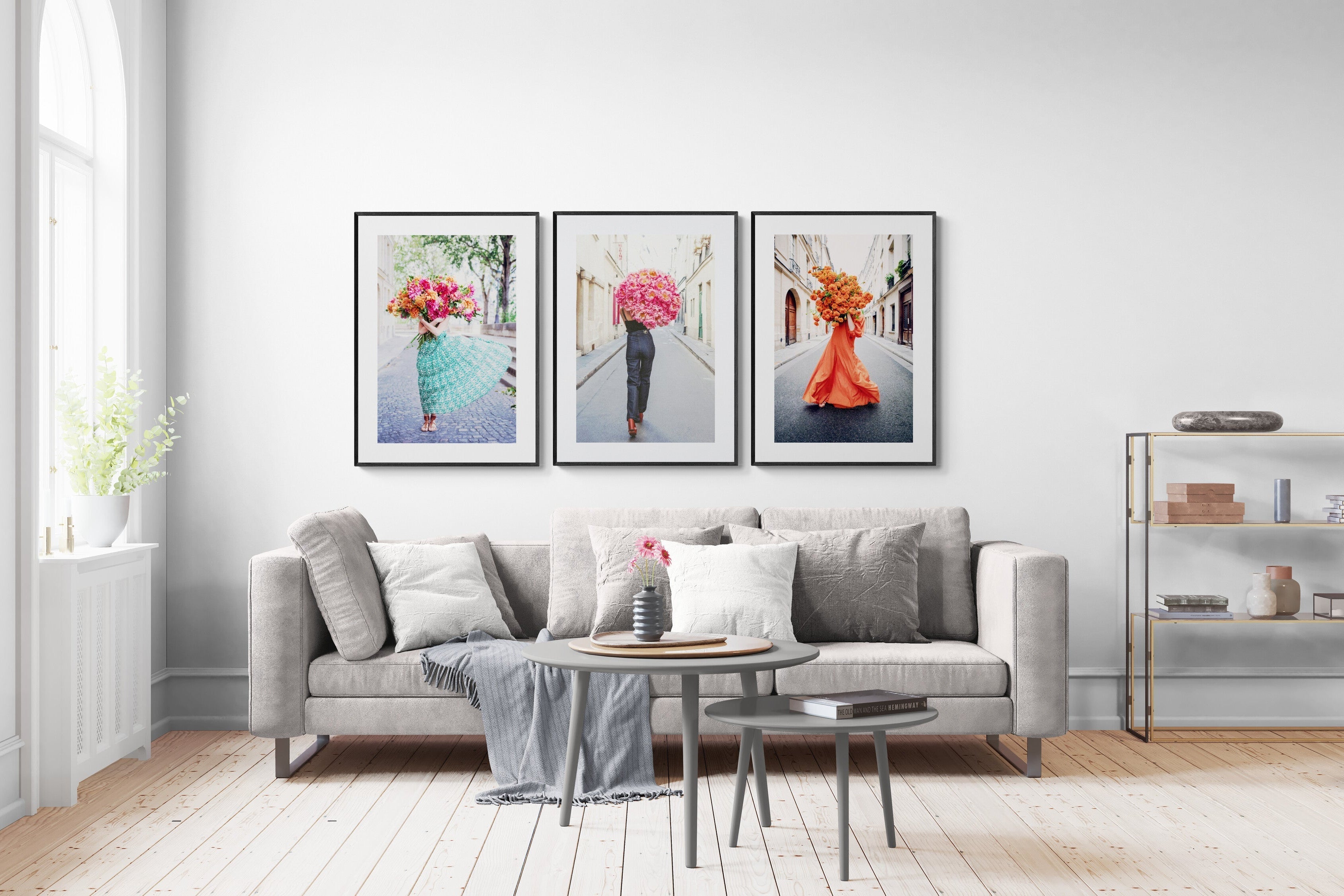
There's a trick interior designers use to make a statement and fill a horizontal space: place two vertical prints side by side and let their energy do the work. When the colour palettes speak the same language, or the mood aligns, the result isn't just a filled wall, it's a room that feels considered, alive, and completely yours.

Why pairing works
A single print is beautiful. Two prints that enhance each other are transformative. The eye moves between them, finding a shared tone, a rhyming feeling, a detail in common, and the wall becomes something more than decoration. It becomes a point of view.
Interior designers have understood this for years. The secret is simpler than most people think: you don't need to match exactly, you need to harmonise.

How to find your pairing
The Young Girl in Bloom series was designed with this in mind. The colour palettes are intentionally clean, which makes them unusually easy to pair with each other, and even with other subjects entirely.
Start by choosing your mood:
- Soft pink and lilac - dreamy, tender, feminine
- Orange and yellow - energetic, warm, full of life
- Blue and white - peace, deep, contemplative
- Black and white - timeless, graphic, architectural
Once you have your mood, your pairing almost chooses itself. And if you want to mix subjects — flowers alongside a beach scene, for example — trust the colours. If the palette works, the combination will too.
Pairings that others have loved
Here's a selection of combinations that customers have brought home:
I Believe In Me & In Bloom

I Saw You Standing There & Atrani Beach

Hold the Faith & Free and Fearless

On My Way & Free and Fearless

Late for Love & See Me

Breathtaking & In Bloom

Centred In Self & Out of the Blue

Wild Child and Great Future Ahead

Find your magic pair
👉 Browse the full collection at carlacoulson.com.
👉 In Australia: Forman Art and Framing (@formanpictureframing)
👉 In Canada: On The Wall Framing (@onthewallframing)