
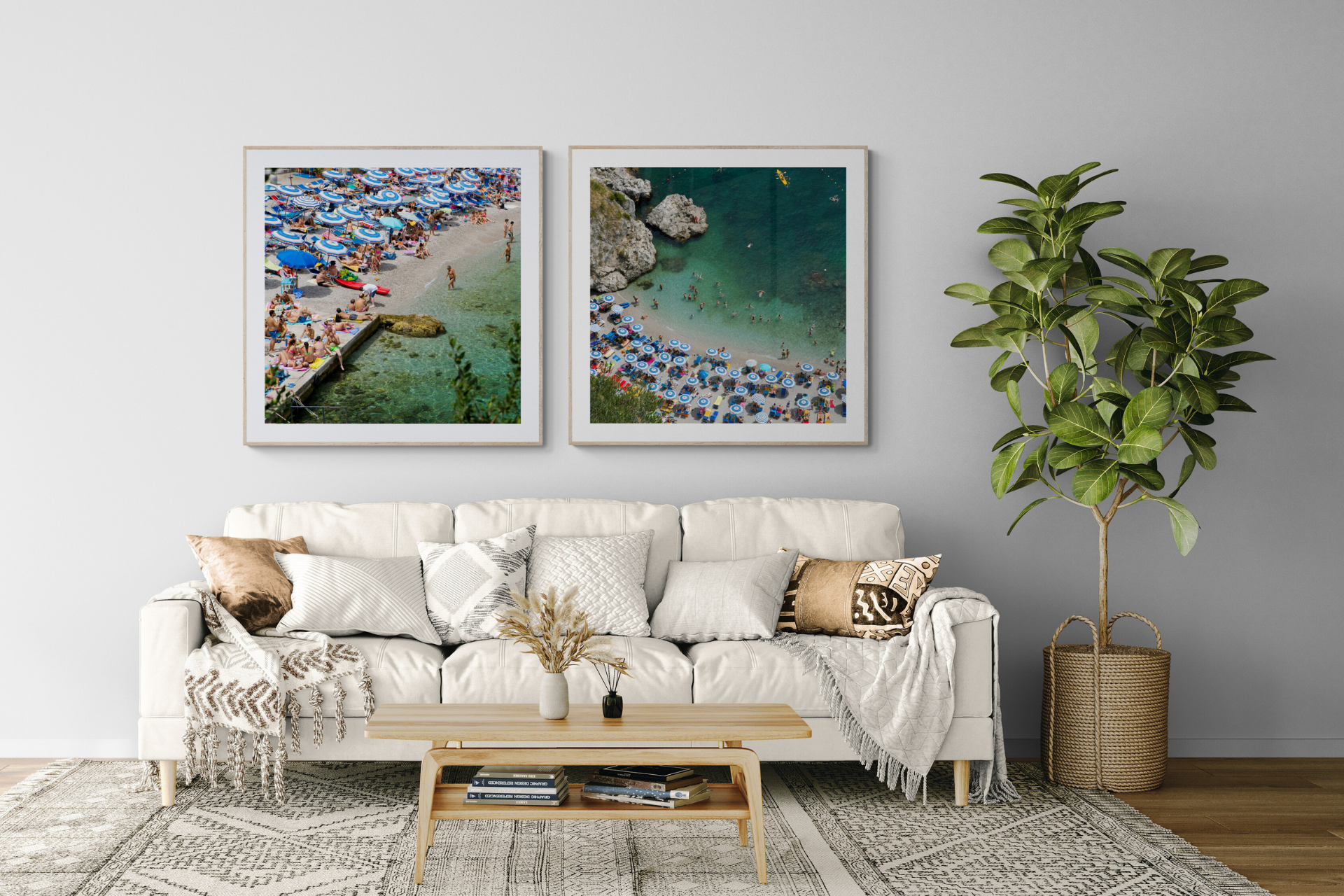
Why 1:1 is the Perfect Statement Wall
There's a reason square format photography keeps finding its way onto the walls of the most beautiful homes, and it isn't just nostalgia for old film cameras.
A square doesn't compete with your wall. It doesn't fight for portrait or landscape orientation, doesn't leave awkward gaps, doesn't force everything into a single rigid grid. It's the most democratic shape in interior design, which is exactly why it's the secret to building a gallery wall that actually works.


Here's how to do it:
1. Let the square do the heavy lifting.
Because every frame shares the same footprint, you can mix sizes; a flurry of 50cm x 50cm images feels intentional, never chaotic. Squares stack, pair, and cluster in a way rectangles simply can't.

2. Choose one palette, not one place.
The trick to a wall that feels curated rather than collected is colour, not subject. Pull from the same Mediterranean register across every frame, bright turquoise water with pops of colour. Bleached sand and that particular hazy turquoise you only get at midday over and over will read as one continuous story.

3. Build in threes, then break the rule.
Odd numbers feel more natural to the eye than even ones. Start with a trio, say, a rocky cove, a stretch of pale sand, a close crop of water meeting stone, then add a fourth or fifth only once the first grouping feels balanced.

4. Find the same graphic structure.
Beaches shot from above, different distances and subjects, same pops of colours, same warmth, same light quality. That's what makes the wall feel like a conversation instead of a slideshow.

5. Respect the negative space.
Leave equal breathing room between each frame, as a rule of thumb, somewhere between 5 and 8 cm.
The result is a wall of beauty and joy.

You can shop my Square Beaches here.
If you're shopping from Australia, you can get them from Forman Art and Framing. You can also get them in Canada from On The Wall Framing.
Stay inspired,
