
The Art of the Frame: Lessons from Real Homes
Will It Look Right In My Home? What Real Homes Taught Me About Framing Fine Art
Hello Beautiful Ones,
You are in for a treat today, a vicarious tour of many talented people's homes, interiors, and the way they have chosen to hang, group, and frame my artwork.
I have had the joy of seeing so many of my work framed beautifully in many different homes, styles, and ways. I wanted to share with you the individual creativity behind framing my work, some of the ideas, concepts, and themes to consider, and the different ways the same artwork can be transformed by the space, frame, and choice of mat boarding.
Let’s go!
Colour harmony with the room
The image below is titled Centred In Self, and it's a beautiful way to ground your space.
When you start to consider your framing, one of the easiest places to start is matching the photograph’s colour palette to the existing decor. It can become a gentle accent or a statement, or you can use it as a colour source for cushions, flowers, and throw rugs.

Centred In Self with a light oak frame as a statement piece that reflects the wooden features in the floors and furniture in a neutral interior, with accent colours in the cushions. (Photo Credit: Hannah Puechmarin, featured in Home Beautiful Australia. Project by Jane Pernell at Eucalypt Studios in Brisbane, room styled by Gabrielle Reinhardt.)


Centred In Self as a statement piece with a simple white wooden frame and no mat board in a neutral, elegant interior. (Photo via Britt Wright of BSW Design.)

The frame is part of the artwork, not a container for it
A frame changes how an image is read, and in this case, the image is Abundance. The same image in a thin black metal frame feels contemporary and graphic; in warm oak it feels intimate and timeless. The frame itself becomes part of the decor and enhances the rest of the room and the artwork.

Abundance in an oak frame at statement size (100 x 150cm) in a small alcove office brings warmth and elegance to this space, styled and designed by Gabrielle Reinhardt Interiors. (Photo Credit: John Downs)

Left: Abundance alongside Breathtaking, both with a thin black wooden frame and white mat board, match the contemporary design of this home designed by Jennifer Reid. Right: An elegant metal frame with a white mat board mirrors the high-end finish of a designer bathroom and its contemporary fittings. (Photo Credits: On the left, photo by Kerri Torrey, Design by Jennifer Reid; On the right, photo and framing by On The Wall Framing, home design by Rosen+Co Design Studio.)
Frame material and texture should echo the softness (or energy) of the subject
Joyful and Unstoppable is a tender image, so natural woods (oak, ash, or walnut) tend to harmonize with the soft colour palette of the subject. Matte finishes read as quieter and more painterly than glossy ones. See Me packs a punch and the stronger oak frame brings a vitality to match the image and adds to the showstopper effect that See Me naturally has.

Joyful and Unstoppable framed as a full bleed on the left and with a thick mat board on the right. (Photo Credits: Left - Photo by Caitlin Mills for The Design Files. Framing by Forman Art and Framing, Room Styling by Annie Portelli. Right - Photo by Lisa Atkinson, Styling and Design by Sophie Kost of My Beautiful Abode.)

See Me framed in a round cornered walnut that enhances the strong colour of the image. (Photo Credit: Orion Custom Framing)
The mat board is the “breathing room” that makes a photograph feel precious
A mat board separates the image from the busy wall and frame edge, directs the eye inward, and signals gallery quality. I love a mat board! Generous mat board mounts can feel like a mark of confidence, a luxe way to celebrate the image. It also has a practical use and that is to keep the glass from touching the print.

(Photo Credit: Left - Photo from Forman Art and Framing; Right - Photo from On The Wall Framing, Project by Avenue Design.)
Statement size: when to go large, and when small wins
Large pieces create a focal point and anchor a room; they are ideal to have that instant wow factor when you enter a room. Smaller pieces give the feeling of intimacy and are suited to hallways, shelves, and reading nooks.

A wow factor wall in Neil Perry’s Rosetta Ristorante in Sydney featuring 10 large-scale black and white beach prints in bold thick black frames. (Photo Credit: Rohan Venn for InDesignLive.)

Left: I Believe In Me framed in gold, sitting atop a Victorian stone fireplace to contrast the black wall. Right: I Believe In Me with a slim, gold metal frame atop a wooden console. (Photo Credit: Left - Valerie Wilcox for Canadian House and Home Magazine, Design by Orsi Panos Interiors, Styling by Catt Therrien; Right - Photo via On The Wall Framing.)

See Me left and right with a white mat board and frame bringing intimacy to a console and kitchen. (Photo Credit: Mike Chajecki, Design and Styling by Michelle Berwick Design, Framing by On The Wall Framing.)
Hanging, grouping, and layout
Groups are one of the artistic and beautiful ways to bring your own personality into a room. Great Future Ahead below is featured in a looser gallery-style arrangement slightly larger than the other pieces to anchor the layout.
A practical guide to groupings is that the centre needs to be at roughly eye level and the gaps need to be consistent gaps (often 5-8 centimetres) between frames. Repeating one frame style across different images unifies a series, and a symmetrical grid gives the feeling of calm and order.

Great Future Ahead is the hero anchor in this beautiful gallery wall by On The Wall Framing, done for Eva Healy of Avenue Design. (Photo via On The Wall Framing.)

This gallery wall grid by Forman Art and Framing repeats the same photograph size and frame across six columns and four rows. The result is a sense of order, while the distinctive frames give the wall its own unique character. (Photo via Forman Art and Framing.)
Matching the frame to the home’s character, and the story behind the work
A rustic farmhouse, a minimalist apartment, an elegant office, a modern dining room and a classic townhouse each call for different frame choices.

The retro feel of the image Positano from the Water in a box frame with a white mat board and white frame matches the vintage design of this elegant room. (Photo Credit: Suzi Appel for Michell Hart of Bask Interiors.)

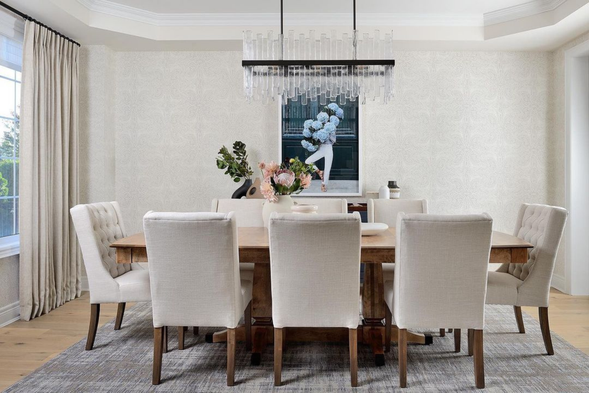
The contemporary feel of Out of the Blue in a beautiful white box frame with a wide white mat board matches this designer dining room. (Photo Credit: Stephani Buchman for Rachel Deeks Design, Framing by On The Wall Framing.)

New Beginnings framed as a full bleed statement size image complements this simple and modern light filled bedroom. (Photo Credit: Mike Chajecki, Design and Styling by Michelle Berwick Design, Framing by On The Wall Framing.)

The simple framing choice of Joyful and Unstoppable in a white frame as a full bleed image fits the colour palette of this sublime office and the luxe fabrics and fittings. (Photo via Noa Blake Design.)
A simple way to remember where to start is: artwork, then wall, then size, then mount, then frame, then glass, then check, then hang.
I hope you enjoyed this tour and it helps with a little inspiration and food for thought for your artwork and home.
Browse the Young Girl in Bloom series here. Pieces in the series are available as limited editions and once an edition sells out, it’s gone.
Warmest,

P.S.
Not sure which size, mount, or frame is right for your space? Send me a photo of your wall and I’ll recommend a combination, free of charge: hello@carlacoulson.com.