Black and White Photography – How and Why We Use It
Copyright Carla Coulson
I love black and white photography, it is part of how I take photos and I couldn’t imagine photography without it. A frequent question I am asked is how and when to use black and white. So I thought today we could have a little chat about black and white in photography.
My fabulous printer in Paris ‘Toros’ of Toroslab, in an interview in Paris Tango said “Black and white is an attitude, a different way of looking at things. I knew many photographers like Cartier-Bresson and Robert Doisneau who preferred to work in black and white. There is an indescribable magic in black and white that is impossible to explain, it is the shadows and the highlights, in the details and in the mystique. Black and white treads that fine line between reality and fantasy.”
Image Copyright Carla Coulson My French Life
SEE YOUR PHOTOS IN BLACK AND WHITE
Not all photos look great in black and white and one of the arts of photography is ‘seeing’ how the image will look before you take it.
When converting colour it is important to have different tones in the photo so your subject will jump out of the background or surrounds ie.. there needs to be contrast in the image. Often if the subject has the same tone it can look a little flat in black and white.
When converting images from colour to black and white make sure you don’t have any strong colour ‘casts’ otherwise the colour cast will be converted to the same grey tone and applied generically to your photo.
WHY USE BLACK AND WHITE?
In film photography you needed to decide prior to taking a photo whether to use black and white film or colour but we now have the luxury with digital photography to choose to convert a colour image into black and white.
The art director on a book once said to me ” a colour image is only valid when the colour is great colour.” Hence if the colours jar, or they are not harmonious or are distracting that is when I convert an image to black and white.
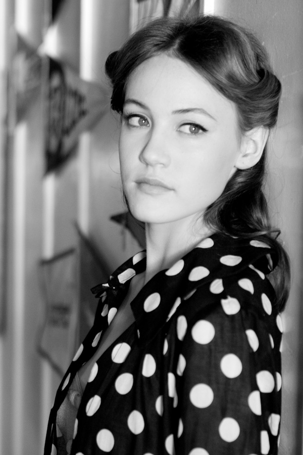
I use black and white often when an image is graphic (like in the fashion pic above), when the photo has been taken in a ‘reportage’ or ‘lifestyle’ way and I want to make this image stronger (like the family in Naples), when I want to cut to the core of a portrait and let the person stand out not the colours like in the first picture in this post.
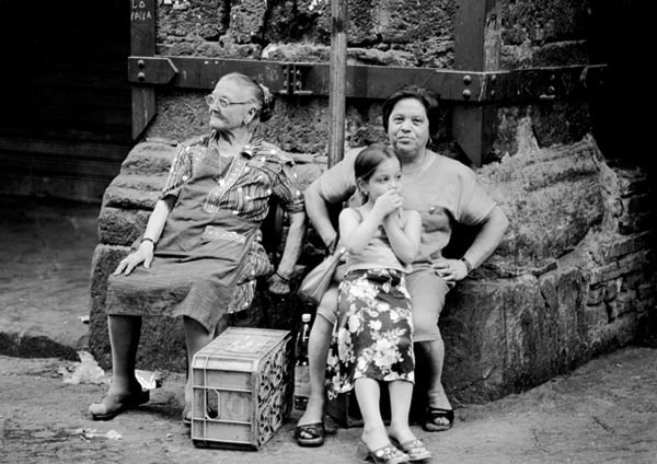
Image copyright Carla Coulson Italian Joy
GOOD SUBJECTS FOR BLACK AND WHITE
When you take away colour you are taking away one of the primary ways the viewer can ‘read’ your image. Therefore there needs to be strong dimensions.
- Tone and Contrast – The photo subject will work best when it has a varied range of blacks, greys and whites. Always look for dark and light areas in your images as this creates tone and contrast.
- Lines, Shape and Form – Images that have graphic elements, strong lines, geometric shapes or form make wonderful subjects for black and white especially when the image has good contrast between the elements. Always look for lines that run diagonally, horizontally or vertically through the image and try and create interesting compositions with them.
- Textures and Detail – All details in photos add to the message and depth of a photo. Black and white works well with textural walls such as brick, sandstone or whitewashed stone especially when the subject is of a contrasting tone. Strong skies and clouds also are wonderful subjects (check out Sebastiao Salgado’s work). A person or detail strongly lit can make a wonderful subject in black and white.
- Portraits – People and the environment you find them in make for strong subjects in black and white particularly when there is good contrast in their clothes, the background and surroundings. Look for interesting hats, clothes or textures in their environment that would make a strong portrait in black and white.
- Reportage/life photography– Storytelling of an event albeit sporting, religious, musical or cultural can be strengthened using black and white and add to the weight and message of the photo.
WHAT BLACK AND WHITE SAYS ABOUT YOUR STYLE
In my interview with Toros he discusses the character of a photographer depending on his taste in black and white. ‘There are some photographers that come to me and say “Toros, I want my photos very dark, very black and deep. There are others they tell me “I don’t like grey; I want black and white without details.” This says a lot about their characters. Once Cartier-Bresson told me, “Toros, don’t print my photos with too much contrast, don’t print them too dark because my character is soft and light.”
Have a look at the following photographers style of black and white and let me know in the comments what you learn about the differences in the style of black and white and what it says about their styles and how it enhances their photos. (sorry you will have to google as their sites are under construction).
Ellen Von Unwerth
Paolo Roversi
HOW TO ACHIEVE YOUR BLACK AND WHITE STYLE?
Film photographers would choose a type of film based on it’s effect. Low ISO films produce fine grain and strong contrast and the higher ISO film produce prominent grain and generally a softer contrast.
With digital conversions we have the choice over contrast and how we want to manipulate the image afterwards. I use a program called DXO filmpak and when I bought it I spent almost a day going through every film option on a series of photos to see the effects that I like. I arrived at a couple of favourites Kodak Tri-x 400 and Ilford Pan F Plus.
These are just my personal preferences but I would encourage you always to try all options and find your favourites as this is part of your photographic style.
I hope this helps you make some decisions about your black and white photography.
“To photograph is to hold one’s breath, when all faculties converge to capture fleeting reality. It’s at that precise moment that mastering an image becomes a great physical and intellectual joy.” Henri Cartier-Bresson
![]()
Check out my Portrait Lightroom Presets here.
Great post, Carla! I have always loved your use of black and white photography; it just suits your style so well. I don’t use it often but when I do, I love the character that it lends to my images (especially portraits) – it’s wonderful.
Hope you’re well! xox
Thank-you Natasha happy you liked the post I am great and hope you and D are also xx Carla
Love Tri-X and Ilford Pan F. They used to be my favourites too. Now alas I’m not doing photography but still love reading about it and peeking at your work! Xcat
Thanks Cat so great that you still lik to keep in touch might make you want to ‘pick up’ the camera again xx Carla
I definitely see a softer focus in Roversi’s work which lends to more dreamy and timeless images. On the other hand, besides a lot of bums and boobs :-), Von Unwerth has a much stronger use of blacks in her work, much more grittier and dark.
Great observation and comments Susan great to compare photographers and get you thinking! EVU does tend to lean toward the whimsical and fun injected portraits and PR has a more serious timeless softness in his B&W! Carla x
This was a fascinating exercise. Both ‘looks’ are stunning but my preference is for that softer look in Roversi’s work but, as you say, it depends on the subject. Sometimes I love strong blacks. I wouldn’t have thought to do this exercise without your suggesting it. You are SUCH a good teacher, Carla and I say it every time – and so generous with passing on your expertise. And you will know how happy I am to see you write about which of the DxO Filmpack options you use. I love your black and white photography. I had found my way already to the Kodak one you mention but not the other. More experimenting needed!
You’re so talented and I love your posts where you share your tips and tricks for photography. Not many photographers out there are sharing their tricks and “secrets” but it only makes me admire you even more 🙂 Thank you for sharing!
Best,
Carin
Happy to share Carin I feel blessed that I can help others even if it is only in the smallest way xxxCarla
I agree with Paris in Four Months,you are indeed generous. Love black & white. xxpeggybraswelldesign.com
x Thanks Peggy
Hi Carla, of the images I googled Ellen Von Unsworth’s seem to be whiter as a whole (to me)and also crisp. Some of the skin tone seems to wash into the backgrounds so it looks unrealistic. I felt Paolo’s work very dark and ‘black’ oriented. He seemed to have a strong contrast in his background in relation to the subject- eg Darker background lighter clothing/hair/face or the reverse. I noticed a lot of his pics were quite grainy especially the backgrounds being blurred out and to me the models skin tone looked more realistic/ warmer rather than white more like a warm dark grey? I think I am a Paolo fan in terms of comparing to my style. For starters I err on the side of using B&W as I just love it. When I choose an image to convert sometimes my brain just sees it as better in B&W but I tend to use a blue filter which gives a darker quality. I like the idea of the DXO program- which one are you using as there are a few?
Loved doing this exercise it is encouraging and thought provoking. Also, I really love your monochromes- they really speak to me, it’s truly beautiful work Carla- be proud. Love and hugs, Corrina Tough.
FABULOUS Corrina so happy you took the time to do this little exercise will always help you in the future xx Carla have a great weekend
[…] on the Lulu Frost website. You can check it out here! • Want to learn a few tricks about shooting in black & white? Carla, unlike many other photographers, is always happy to share a few tricks and tips about […]
I too believe B&W and color both have their uses. I love to use B&W for people and street scenes but not 100% of the time. I downloaded the 30 day trial of the editing program you suggested and so far am really enjoying using it! I will most likely buy it as it is very reasonable too! Thank you for all your tips. Love and remember them all!
To Carla or anyone- expert or essential edition?
[…] great site that explains the emotion of B&W is this one here. It is a short blog post but covers a bit of everything in it. Mrs Coulson explains an […]
Photo
They used to be my favourites too. Now alas I’m not doing photography but still love reading about it and peeking at your work. great site that explains the emotion of B&W is this one here. It is a short blog post but covers a bit of everything in it. I have always loved your use of black and white photography; it just suits your style so well. I don’t use it often but when I do, I love the character that it lends to my images.retaining walls
They used to be my favorites too. Now alas I’m not doing photography but still love reading about it and peeking at your work. great site that explains the emotion of B&W is this one here. It is a short blog post but covers a bit of everything in it. I have always loved your use of black and white photography; it just suits your style so well. I don’t use it often but when I do, I love the character that it lends to my images.